Choose a theme for your survey
A theme sets your survey's colours, fonts, button style and corner radius in one click. Pick one that matches your brand before you publish, or leave the default and change it any time — a theme change applies the moment you save.
Steps
- Open the survey and go to its General tab.
- Find Survey Theme and click any theme to select it.
- Click Save.
The 22 themes
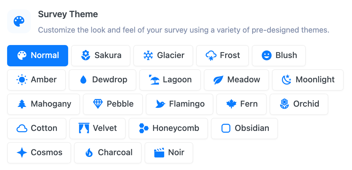
SurveyX ships 22 built-in themes. Six are free:
Normal, Sakura, Glacier, Frost, Blush, Amber
The other 16 need Pro:
Dewdrop, Lagoon, Meadow, Moonlight, Mahogany, Pebble, Flamingo, Fern, Orchid, Cotton, Velvet, Honeycomb, Obsidian, Cosmos, Charcoal, Noir. See pricing.
Clicking a Pro theme in the free plugin sends you to the upgrade page instead of selecting it.
A theme is one colour set
There's no light-mode or dark-mode toggle on a theme — each of the 22 is a single, fixed set of colours, fonts and sizing. The set covers both light and dark designs: seven of the themes (Moonlight, Orchid, Velvet, Obsidian, Cosmos, Charcoal, Noir) have a dark background, and the rest are light. If you pick one of the seven dark themes, SurveyX suggests uploading a light-coloured logo in branding settings so it stays visible.
Twenty-one of the twenty-two built-in themes paint their own background, and every one of those keeps its question and answer text at 6:1 contrast or better against it, with the lighter description text at 4.5:1 or better. Switching between them never trades away readability.
Normal is the exception, by design. It paints no background at all, so the page behind the survey shows through and its text takes your site's own colour. That makes it the theme that blends in most completely — and the one theme whose contrast is yours rather than SurveyX's. If you use Normal on a dark or heavily patterned background, check the survey is still readable, or pick one of the other twenty-one, which carry their own ground.
Free vs Pro
| Free | Pro | |
|---|---|---|
| Built-in themes you can select | 6 | All 22 |
| Build or edit a custom theme | Not available | Yes — see Build a custom theme |
Want more control than a built-in theme gives you — your own colours, fonts, background image or custom CSS? That's the custom theme builder, covered in Build a custom theme, and it needs Pro.
What respondents see
Every part of the survey that isn't overridden by a custom setting — background, question text, buttons, answer options — picks up the theme's colours, fonts, corner radius and button style. A theme change applies to every respondent from the moment you save; nobody mid-survey sees their own session switch themes.
Troubleshooting
I can only select 6 themes. The other 16 need an active Pro licence — see pricing.
I want the same theme to look different in light and dark mode. Not possible — a theme is one fixed colour set, not a light/dark pair. Pick a light theme and a dark theme separately if you need both.
A theme doesn't quite match my brand. Built-in themes aren't editable. Duplicate the closest one as a starting point in the custom theme builder (Pro) instead — see Build a custom theme.